Category:
Web Design
Client:
Internship
Duration:
3 months
// REFLECTION
Prior to this internship, I had no experience in UI/UX designs. Only an introductory university class, and an eye for design. I am super grateful for this experience as it led me to discover a passion that was buried in me.
First Week
Studied the design systems of Atlassian, Material Design, and IBM's Carbon, focusing on UI components, their names, and functionalities. Conducted usability tests to evaluate their effectiveness.
Second Week
Explored various design systems and identified my favorite. Delivered a presentation on Airbnb's design system, highlighting its strengths and unique approach.
Third Week
Developed a "mini" design system tailored for NexSoft, demonstrating consistency, scalability, and usability.
Fourth Week - End
Led a website revamp project for NexSoft, implementing a cohesive visual design and improving user engagement.
// REDESIGN
Redesign begins
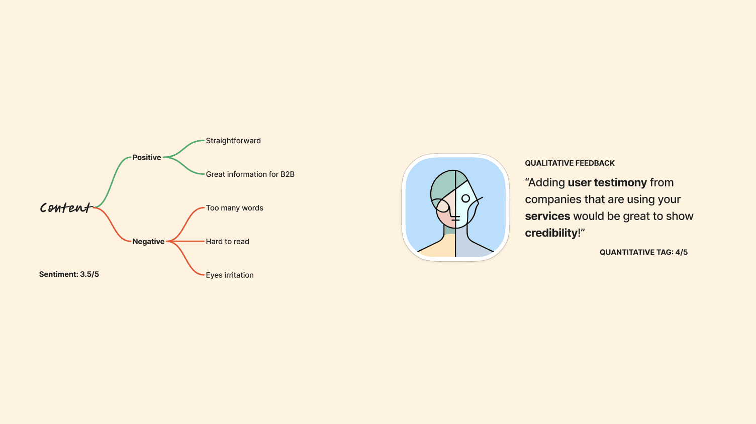
The keywords that were assigned to me before redesigning this website were modern and conservative. I conducted user survey, competitive analysis, and qualitative coding and here is how it went ↳
// KEY INSIGHTS
A lot of users agree that the readability needs to be improved. Currently there are too many words on the website and it looks super cluttered! (that it irritated users' eyes).
However, we also received a positive sentiments from some. They mentioned that the content was straightforward and provided great amount of information as NexSoft is a Business to Business (B2B) company.
After conducting competitive analysis along with the survey, we noticed that the website would benefit from adding user testimony as it enhances credibility — especially for companies who are looking forward to use NexSoft's Distribution Management System. Knowing that we had a lot of big companies using our service, we could also put emphasis on that.
One word to sum it up would be to have a balance..

OLD DESIGN (LEFT), NEW DESIGN (RIGHT)
Introducing CTA button to invite and engage with users
Introducing flat icons
Smarter and a more modern approach to the use of geometric shapes
A more accessible language switch button
Reduces visible text and minimizes cognitive load through the use of accordion
Introduces interactivity through the accordion, increasing user engagement with the content
Enhances readability and visual hierarchy, making information easier to digest
Adds visual context and engagement, aiding in the communication of complex ideas
// APPROACH
Why these features?
Readibility
Snow-white (#F9F9F9) was used instead of White (#FFFFFF) to avoid eye irritation due to the prolonged computer use.
Cognitive Load
White backgrounds in general are less likely to distract or overwhelm users, especially crucial when they have to take in a lot of words and information.
Scalability
Adding new array of products are very common in a startup. New features can easily be integrated in a white-based design without having to cause visual clutter.
Flat Icons
Adding new array of products are very common in a startup. New features can easily be integrated in a white-based design without having to cause visual clutter.